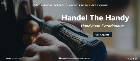
Handyman Handel
by Adrienne Warden

About The Project
The site is based on a handyman – construction service business. This business has been in operation for 4 years. Its online presences consist of an Angi’s listing, an Instagram and Facebook page. The business branding is an icon which was chosen as a placeholder when the business opened.
Project Overview
Build a service business website that:
- Can be scaled into an e-commerce site with ease
- Builds customer trust and confidence
- Increases leads, on-site quotes and projects
My Role
I am the sole researcher, creator and designer of this project.
My Responsibility
I conducted competitive site audits, created the mockups, prototypes, components and basic design system for the project.
Project Duration
May 2022 — June 2022
Research
We did a site audit not to scope out the competition, but to get a feel for how handyman sites are designed. The goal of our audit was to determine if the competitor sites had a discernable user flow and what elements are featured in the design layout.
Mr. Handyman NYC
Setup NYC
Handy Dan
Insights
1
Call to Action
There are several calls to action dispersed throughout the sites. Primarily the user is asked to request a quote or call a number with questions.
2
Trust
Each site builds user trust/confidence with reviews, portfolios and credentials (i.e., contactor license number).
3
Featured
“About” and “services” are featured content. The portfolio or project images come in a close 2nd.
4
Flow
Mr. Handyman NYC had a decernable flow. Setup NYC does have a flow, however the over abundance of copy confuses it.
User Flow
The sites primary KPI is to generate leads that can be converted into projects. The flow acts as a funnel that can be tracked against actual user flow.
Users Experience
While the site owner is our user, we want the site users to feel a sense of confidence in using the site, submitting data and scheduling an on-site quote. Our focus for building user confidence was…
1
Security
A secure site where users feel confident sharing detailed information.
2
Content
Content with clear calls to action. Descriptive content that highlights benefits and advantages of using our services.
3
Credentials
Insurance status, license and registration prominently displayed. Links to governing bodies to view history.
4
Call to Action
Verifiable reviews. Users completing an on-site quote have the option to visit and speak directly with former clients.
Design Process
While the site owner is our user, we want the site users to feel a sense of confidence in using the site, submitting data and scheduling an on-site quote. Our main focus is to create a design/layout that builds user confidence and can be executed as a CMS or straight code website. The aim is a starter site that’s easy to scale and maintain. We started the design process building a basic design systems that’s organized easy to update and scalable.
Mockups
View Mock Up in Adobe XD
Solution
- Responsive and visually appealing across devices
- A one-page site
- Calls to Action
- Accessible
- Easy to scale and integrate
- Ready for user testing
View Low-Fi in Adobe XD
Next Steps
- Add another cta/user incentive
- Create and add a brand logo
- Refine design and create hi-fi prototype for user testing
- Conduct user testing
View PDF version of Case Study
Next Steps
- Add another cta/user incentive
- Create and add a brand logo
- Refine design and create hi-fi prototype for user testing
- Conduct user testing
View PDF version of Case Study
Let’s Connect
Thanks…You cantact me at:
adrienne@adrienneaew.me
